HCDE 536: ASSIGNMENT 3
Appendix
Figma Low-Fidelity Prototype
Design Requirements and Patterns
Must be easy to navigate and personalize without being overwhelming (Search for and filter templates easily with event categories and/or parameters)
Multi-Select Filter Chips (The "Specific Narrower")
Users can quickly tap visual "chips" to filter by parameters like Time to Complete, Expert Level, or Event Type.Structural Form: Filter Chips / Horizontal Scroll Pill-Menu
Tradeoff:
Low Decision Friction: It provides clear boundaries. Tapping "Under 30 mins" instantly clears out complex, multi-day templates, making the remaining list feel much more manageable.
Visual Friction: Having too many chips visible at once can look like "button soup," adding to the visual noise. It requires careful grouping to keep the interface clean.
2. Must utilize consistent layout and/or elements: The design must maintain a consistent layout and use uniform visual elements (such as typography, colors, spacing, and components) throughout all sections.
Global Navigation Rail:
A persistent, vertical or horizontal bar that remains in the exact same position across the app. It uses identical icons and active states regardless of the "mode" the user is in.Structural Form: Navigation Rail / Menu bar
Tradeoff:
Low Cognitive Friction: It provides a "permanent home base." The user always knows exactly how to get back to their saved kits or the search bar, which provides a sense of security and control.
Space Friction: It permanently occupies screen real estate. On smaller screens, this can make the "execution" area feel cramped, potentially adding to the feeling of being "hemmed in" by a busy interface.
3. Must have undo/redo mechanisms: The system must have an undo/redo mechanism accessible via a single-tap interface or standard keyboard shortcuts, allowing for the immediate reversal of sequential state changes.
Global Action Bar (The "Safety Anchor")
A persistent set of "back" and "forward" arrows located in a fixed position (usually the top-left or top-right) that remains visible throughout the appStructural Form: Gesture-Based Interaction / Accelerometer Trigger
Tradeoff:
Zero Visual Clutter: It keeps the interface 100% clean, which is ideal for reducing overwhelm. There are no extra buttons to look at or accidentally tap.
Knowledge Friction: It is "invisible." A user in a state of execution fog may not remember the gesture exists, leading to a feeling of helplessness if they make a mistake and don't see a visible "Undo" button.
4. Must have a unified project view: The platform must have a project-based dashboard that aggregates and groups all active modular templates by their specific event parent
Project-Based "Buckets" (The Container)
A high-level dashboard where each "Event" is a distinct visual card. Opening a card reveals all the "Kits" and "Templates" currently active for that specific project, grouped together.Structural Form: Card-in-Card / Nested Grid
Tradeoff:
High Mental Organization: It mimics how people think ("I'm working on the Jeopardy Night project now"). By walling off other projects, it prevents the "cross-talk" that causes cognitive overwhelm.
Navigation Friction: It adds a "folder" layer. The user has to click into a project before they can see their work, which adds one extra step if they are trying to jump between different events quickly.
5. Must have a Quick-Start option: System must trigger a view that collapses non-essential modules to highlight three critical planning phases (and accompanying templates).
The "Complexity Toggle" (Mode Switch)
A prominent, labeled switch (usually in the top header or persistent footer) that allows the user to jump between a Basic view (the "First 3" focus) and an Expanded view (the full project list).Structural Form: Toggle Switch / Segmented Control
Tradeoff:
Low Cognitive Friction: It provides a "safe" default. A foggy user can stay in "Basic" mode as long as they need, knowing that the rest of their work is safely tucked away but accessible with one click.
Mode-Blindness Friction: Users might forget which mode they are in. If they are in "Basic" and can't find a template they know they created, they might panic, thinking it was deleted rather than just "hidden."
6. Community-Endorsed Content: The system must support community-driven discovery, allowing users to identify and prioritize high-quality templates based on user feedback and ratings. (See/Sort templates based on community-endorsed ratings.)
Popularity Metric (Like-Counter)
The template display includes a prominent heart or thumbs-up icon with a numerical count (e.g., "1.2k Likes"). This is often placed in the top corner of a card or directly under the title.Structural Form: Icon + Counter (Badge or Label)
Tradeoff:
Low Cognitive Friction: It provides an instant "popularity score" that helps the user's brain prioritize which card to click first without having to read detailed reviews.
Subjectivity Friction: A "Like" is a low-effort interaction. It tells the user that people enjoyed the template, but it doesn't necessarily prove the template was successful or easy to finish, which might lead a foggy user into a complex workflow that isn't actually right for them.
7. Must have embedded expert tips: To help users throughout the event planning process.
Contextual Info-Popovers (Just-in-Time)
Small, unobtrusive icons (like an "i" or "?") placed directly next to complex fields. When tapped or hovered, they reveal a brief tip explaining why an expert recommends a specific choice.Structural Form: Popover / Tooltip
Tradeoff:
Low Initial Friction: They stay out of the way, keeping the interface clean and preventing visual "noise" that adds to the fog.
Discovery Friction: The user has to actively seek them out. If a user is truly paralyzed, they might not even think to click the icon for help.
8. User-Curated Content Saving & Retrieval: The system must support content saving and retrieval, allowing users to easily mark, store, and revisit preferred templates for future use. (Bookmark templates they like to reference later.)
One-Tap "Quick-Save" (Bookmark)
A simple, ubiquitous icon (like a ribbon or heart) located on every template card and within the chat interface that allows for immediate saving without leaving the current view.Structural Form: Floating Action Button (FAB) or Inline Icon Toggle
Tradeoff:
Low Interaction Friction: It requires zero thought or "filing." The user can mark 10 potential options while browsing without the cognitive load of deciding where they go.
Organization Friction: It creates a "junk drawer" effect. If the user saves 50 templates, the "Saved" folder becomes its own source of overwhelm (the "Fog of Choice") when they try to retrieve them later.
Testing Documentation
What surprised you about using it vs. imagining it?
There were a lot more flows I needed to make in order to fully encompass the concept I was envisioning than I originally thought
Many of the actions and flows that felt intuitive in theory required additional visual cues or prompts to be clear and usable in the actual app.
Contrary to how complex it already seemed in vision, the actual user interface was not as cluttered and chaotic as I imagined (especially when in “prototype” mode with all the interaction arrows connecting all over the place)
I also ended up adding some design requirements based on bumps I ran into or observations where I thought adding certain elements could make the user experience even better (for example, expert tool tips).
Did your design requirements hold up in practice?
Yes, most of them did! Since I had the requirements going into it, I was able to intentionally design my prototype and base the interactions around them.
This design requirement in particular, “Must utilize consistent layout and/or elements” was very interesting to me in that it held up more out of convenience as the designer (from duplicating frame layouts) rather than intentional practice. Of course there were some exceptions where I had to go back and make sure there was alignment across different screens, but it was largely unintentionally intentional.
What flowed well? Where did you notice bumps?
The overall user flow journey made sense, but there were a couple bumps when it came to making sure I was able to get back to the homepage and not stuck in a loop somewhere in the flow
What would you change based on your experience?
Changed some label verbiage to prompt more intuitive actions
Added a menu bar
Added a universal anchor (back arrow) so I could always get back to the previous screen
I would also love to have more people test my prototype
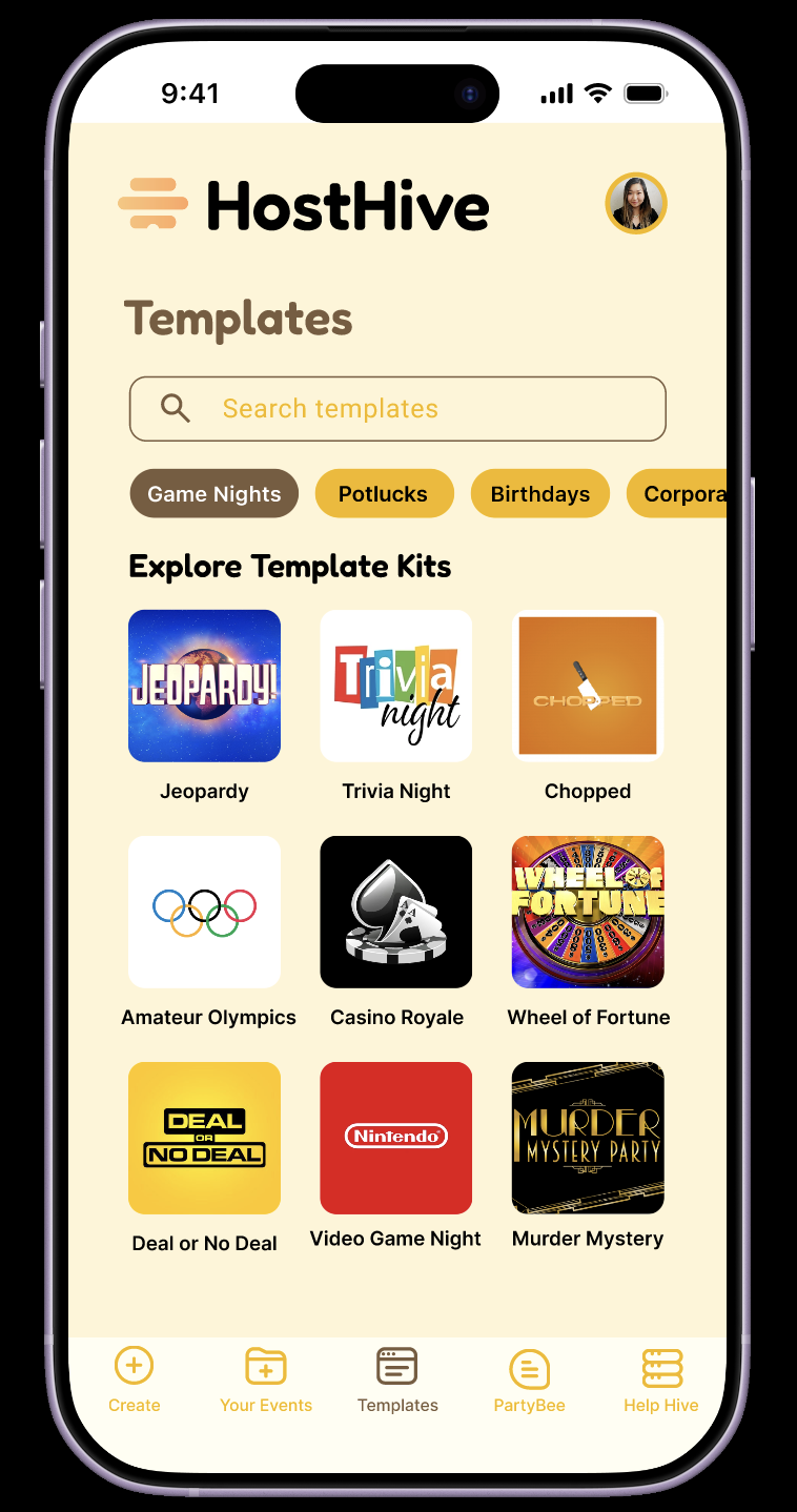
Template marketplace filtered for “Game Nights” event planning template kits.
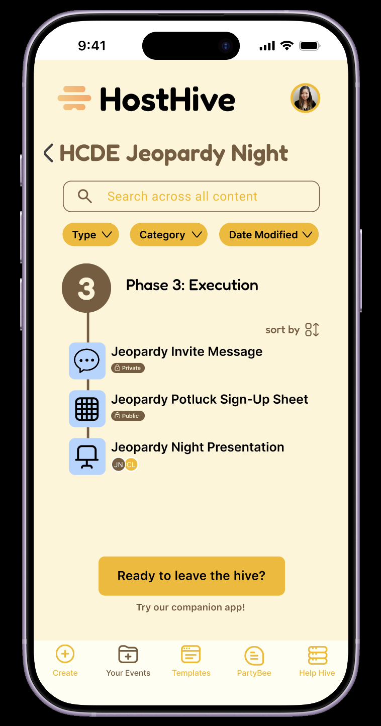
Execution phase with associated documents of an event the user is actively planning.
AI Usage statement
AI was used to generate design patterns from my specified design requirements, as advised by the assignment instructions. From the generated results, I selected and further refined design requirements that made sense to my app and concept. AI was also used to help generate name ideas for the app.